
Pilates Studio Colour Trends for 2026
Pilates branding is moving away from cold, overly clinical colour palettes.
In 2026, studios are leaning into softer, warmer and more lifestyle-led tones inspired by fashion, interiors and boutique hospitality brands. The overall aesthetic feels calmer, more elevated and way more intentional.
People want wellness brands that feel aspirational but still welcoming. Colour plays a huge part in creating that atmosphere online and within the studio itself.
The strongest Pilates brands are focusing less on trend-driven colours and more on palettes that feel timeless, refined and easy to build a full visual identity around.
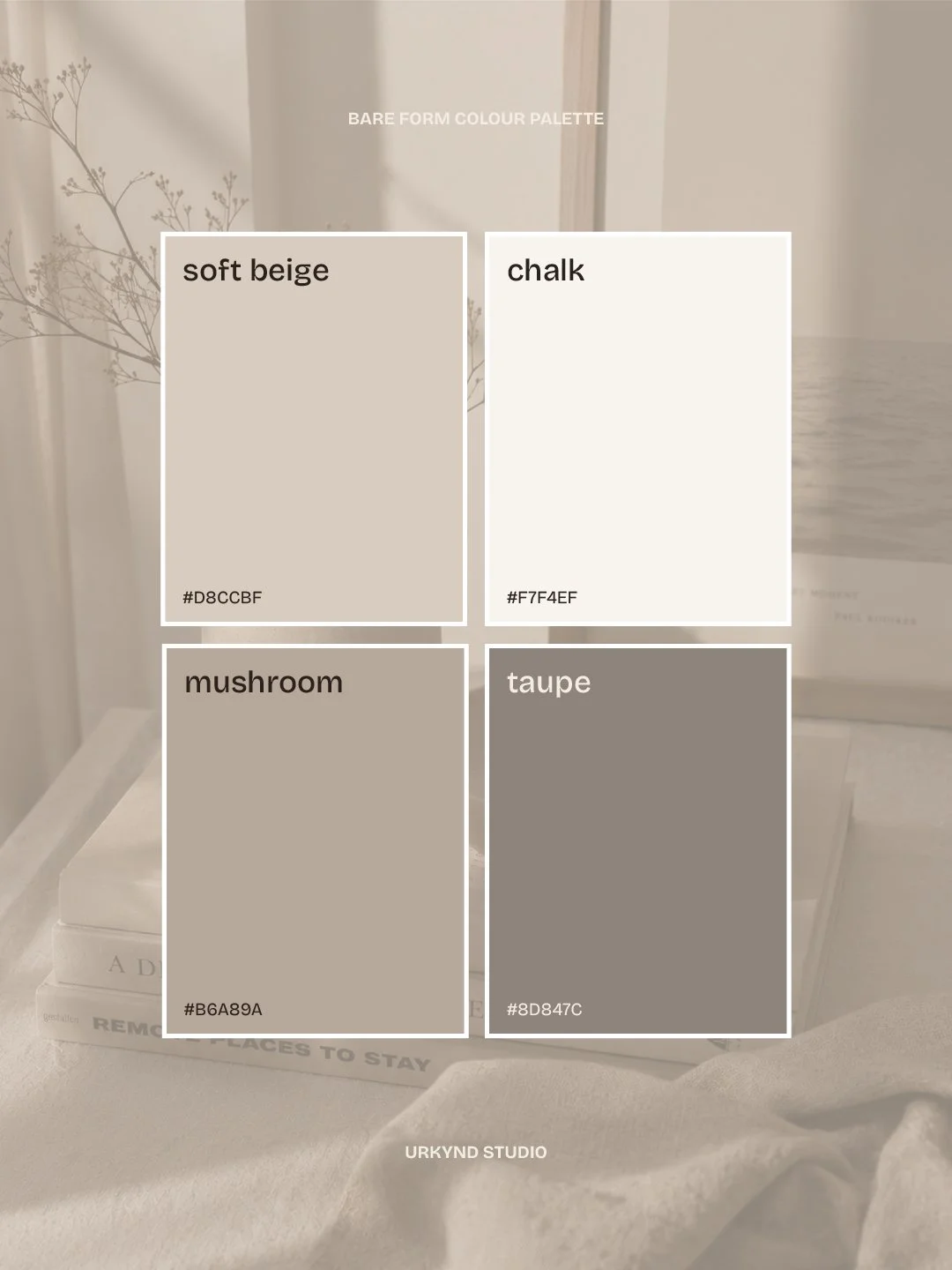
Warm Neutrals Are Replacing Harsh Minimalism
Bright white branding and stark black accents are slowly being replaced with softer neutrals and warmer tones.
Soft beige (#D8CCBF), chalk white (#F7F4EF), mushroom (#B6A89A) and taupe grey (#8D847C) tones create a calming, minimal Pilates brand aesthetic inspired by Scandinavian interiors and quiet luxury wellness spaces.
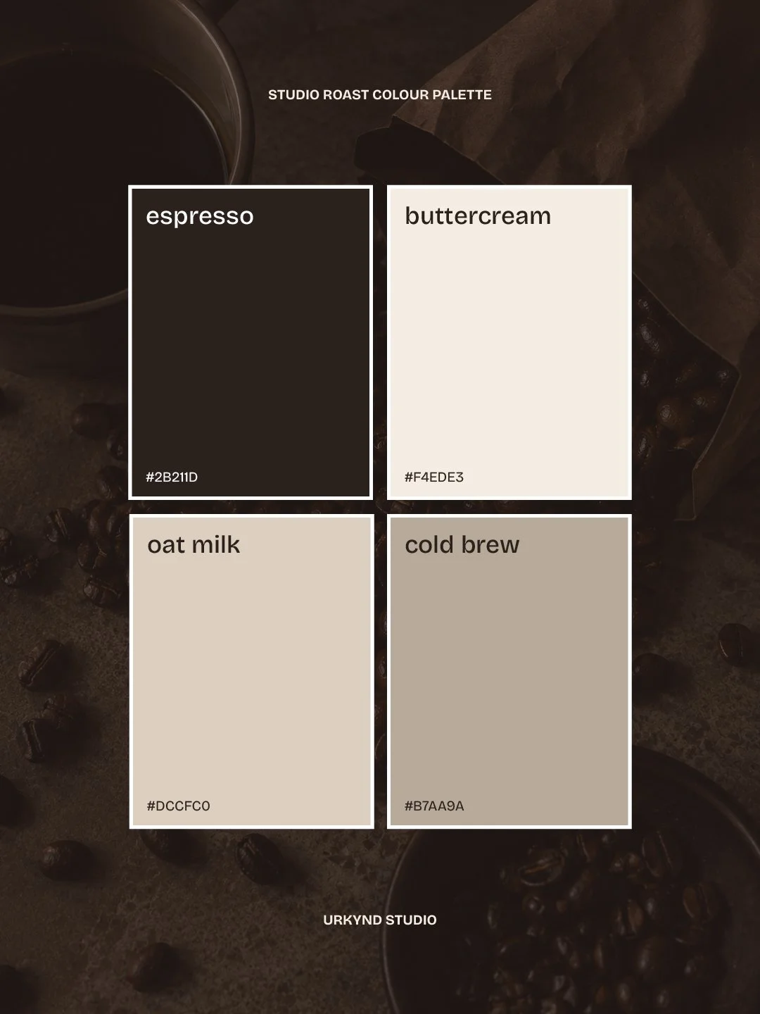
Espresso Browns & Deep Chocolate Tones
Richer brown tones are becoming much more common across luxury wellness branding.
Deep espresso shades instantly make a brand feel more elevated and fashion-inspired while still keeping warmth within the palette. These colours work especially well for Pilates studios wanting a more premium, editorial aesthetic.
Deep espresso (#2B211D), butter cream (#F4EDE3), oat milk (#DCCFC0) and warm stone (#B7AA9A) tones create a luxury, editorial-inspired Pilates aesthetic with a softer alternative to harsh black and white branding.
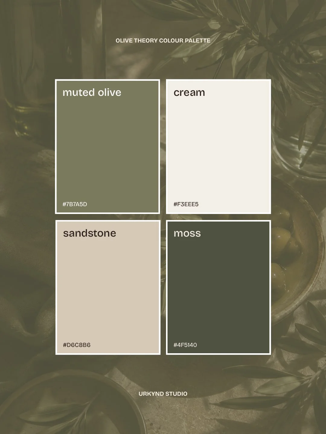
Earthy Greens & Muted Olives
Muted olive tones are becoming huge within Pilates and wellness branding.
They feel calming, elevated and naturally connected to wellness without looking overly obvious or cliché. Softer greens work especially well when paired with warm creams, espresso tones or soft stone colours.
Muted olive (#7B7A5D) paired with warm cream (#F3EEE5), sandstone (#D6C8B6) and deep moss (#4F5140) creates a grounded but elevated wellness palette that feels calm, modern and premium.
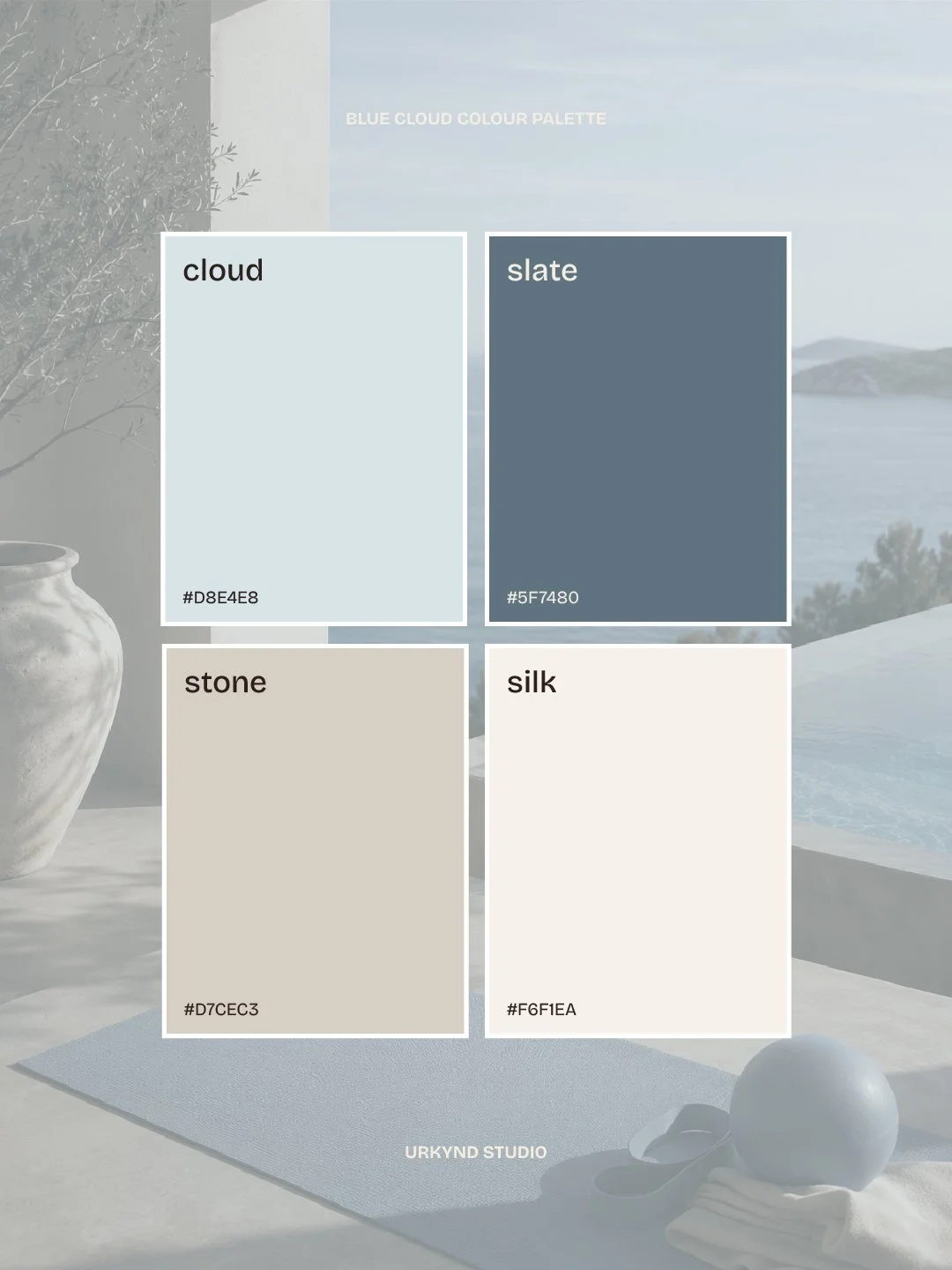
Soft Blues & Powder TOnes
Some Pilates studios are also moving towards softer powder blues and muted grey-blues to create a calmer, spa-inspired atmosphere.
These tones work especially well for brands wanting a more Scandinavian or coastal-inspired aesthetic while still keeping the branding minimal and modern.
Cloud blue (#D8E4E8), mineral grey (#B8C4C7), deep slate blue (#5F7480) and silk cream (#F6F1EA) tones create a softer, spa-inspired Pilates identity with a more elevated and calming feel.
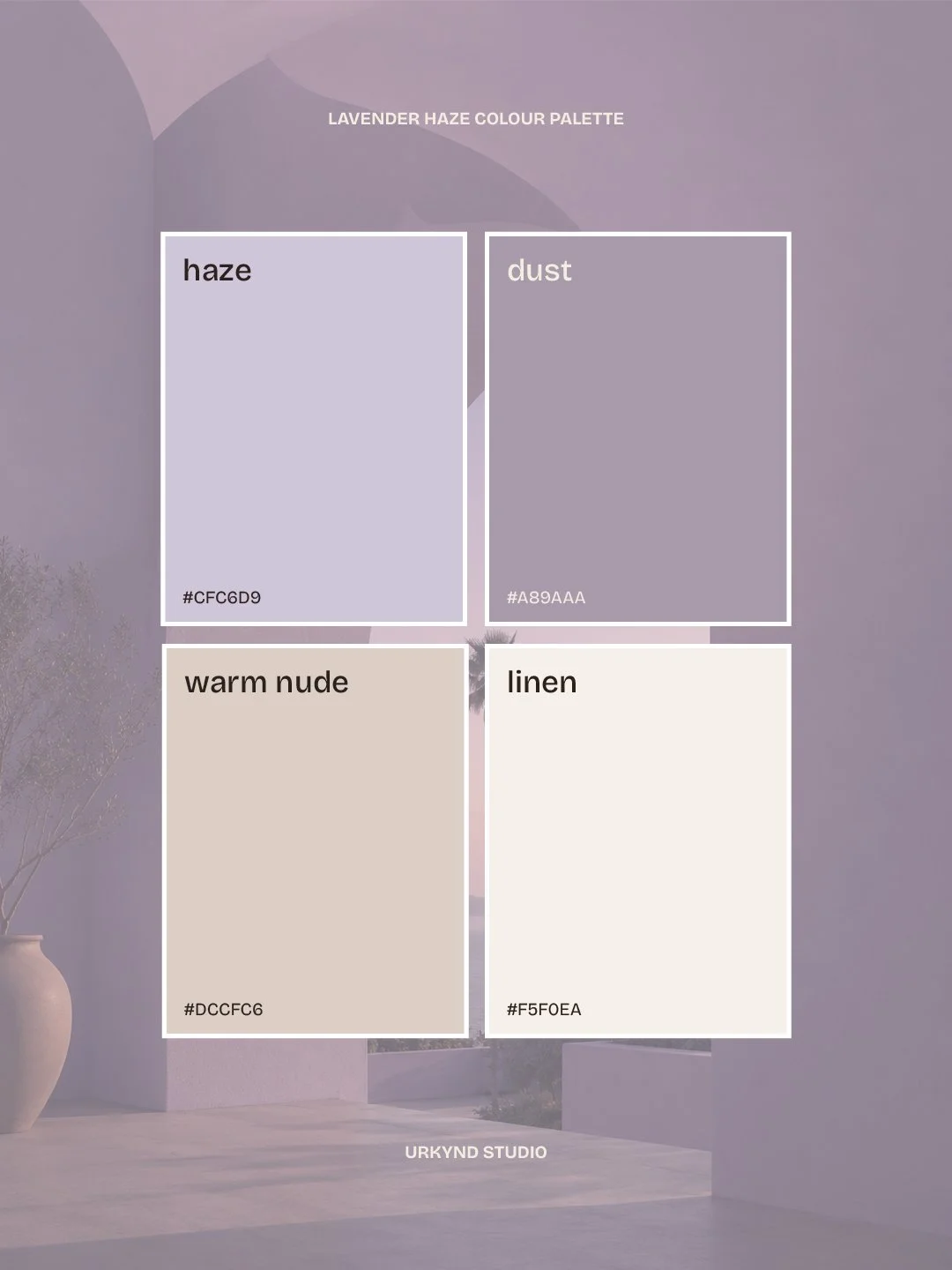
Soft Lilacs & Dusty Mauve
Soft lilac tones are becoming increasingly popular within modern Pilates and wellness branding, especially for brands wanting a more feminine, fashion-inspired aesthetic.
Unlike brighter pastel palettes, muted lilacs and dusty mauves feel softer, calmer and more elevated when paired with warm neutrals and creamy tones. They create a more editorial, luxury wellness feel while still keeping the branding minimal and modern.
Soft lilac (#CFC6D9), dusty mauve (#A89AAA), warm nude (#DCCFC6) and silk cream (#F5F0EA) tones create a calming, feminine Pilates palette inspired by luxury skincare branding, balletcore aesthetics and soft wellness interiors.
Looking for Pilates Branding or Website Design?
At URKYND Studio, we create branding and website design for modern wellness, pilates and lifestyle brands across the UK.
From Pilates studio branding and reformer wellness identities to Squarespace and Shopify website design, we help brands create an online presence that feels elevated, aspirational and genuinely memorable.